Wednesday, 29 February 2012
Change in the sale of CD's over the last years
Over the last nine years, the sales of CD's has fallen over 52%. This is because the digital downloads have increased so much, for example Itunes. Itunes has become one of the most used programmes to download music online.
Quote found on the internet:
'Driving the point home, approximately 31% of all 12-24 year olds said they had downloaded digital music files from the internet in 2000. 10 years later, that figure has more than doubled to about 65%.'
Youtube has also been another very common soruce of downloading music in the past years, I would say about 5 years now. There are various website which download songs with just the link of a song on Youtube.
back of the digipak cover
The back cover of my CD will look like this but I have to add a picture of Alvaro(Pitbull) which will be taken sometime this week!
FINAL EDIT FOR GEROGIA. digipak
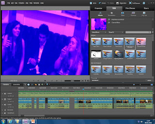
After trying different effects, I have decided to use a simple colour wash related to my story line. I chose to do a pinkie one because Alvaro has the same, and Rob has a green colour wash, and right at the end of the video, when Georgia is walking out, I put a pink colour wash there to 'explain' and show who she chooses after all the partying, etc. She chooses Alvaro with the pink colour wash, and this is why I chose to have it on my digipak, I consider this to be a key part in my video.
Tuesday, 28 February 2012
HALF OF MY DIGIPAK DONE!
Editing Emily's picture..

Emily's character in my video is the girl who always tried to be involved with boy, in way trying to say she wants to have the reputation of a player, she tries with all the boys, but non of them ever fall for her, unlike Rob falling for Georgia. This is why I decided to have a kind of Sepia or Black and White colour wash. In my opinion, this makes her look quite irrelevant in the whole story line of my video. Although she is not irrelevant, she is not the main character.
Thursday, 23 February 2012
EDITING THE PHOTO OF GORDONSTOUN HOUSE
Gordonstoun House is a very old building but quite simple at the same time, this is why I thought I would make the editing very simple and put the effect 'Old'. I strongly think this will be the final edit for the digipak cover side of Ghouse.
STAR IMAGE
Marc Anthony has always been represented as a simple person, always dressed smart and very appealing to the cameras. This is a very good relation between Rob and Marc as they are both representing simple people, faithfull, etc. However, on the other hand, we have Pitbull, who has always been represented as a player, and he has the reputation of being a player. All his songs talk about the same thing, and all the videos he is involved in have kinf of teh same story line. I have attached some pintures to show. Alvaro's character int he video is also the one of being a player which I think has made a very good relation again.
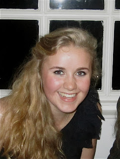
EDITING GEORGIA PATTERSON FOR THE COVER
I decided to havea colour wash effect on her face because the whole video is divided in two people with different ideas but one thing in common, they both want Georgia. Alvaro has a pinkie colour wash( done the same to her bellow) and Rob has a green colour wash( done the same to her on the right). However, I am not keen on any of these effect and will carry one trying some more.
Monday, 20 February 2012
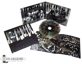
DIGIPAK EXAMPLES.
I have attached some examples or digipaks which have given me idead to inspire mine and kind of show me the way they are done.
testing the font for digipak
I like the one to the left because it is quite simple but different in a way. The letters not being straight could make the whole "sentence" more exciting and attention catching.
 However, I also agree that the simpler the better, which would make this second on the right test a better option.
  This last one on the left I've tested has, in my opinion turned ou to be the best one. As said, very simple and forward which will make things easier instead of trying to make it look "too exciting".
Thursday, 16 February 2012
HOW DOES DAVID GUETTA PROMOTE HIMSELF?
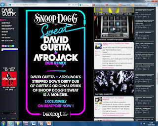
The first thing I did when I had to research David Guetta(an artist very similar to my original artists Pitbull and Marc Antohony) was to check his website and take a screen shot of it to show the way its layed out.
As you can see, the main colour used on the website is a hot pink which really attacts people's attention.
The font seems to be very simple, quite small and not too much text.
Guetta promotes himself online on Facebook, Twitter, Itunes, Spotify and Chat room.
The website can sometiems change and have different colours or posters. This is another way of promotion for David Guetta.
This is two other lay outs for Guetta's website. These shows information about the newest releases by him.
Wednesday, 15 February 2012
PLAN OF MY ADVERT
Thursday, 9 February 2012
another rough cut..
The wobbly bit at the beginning with the shoe is not meant to be there. I will export it properly after I get some feedback to see if it needs any changes.
Planning the ancillary task.
I finished the final rough cut of my music video, i am now uploading it onto Youtube to be able to show the class, friends, facebook, etc so I can get some feedback to edit it again, or leave it the way it is.
I have to start think about my ancillary task now and how the original song was promoted and how the artists promote themselves. I am looking at some old blogs to get some ideas and help for mine.
I have to start think about my ancillary task now and how the original song was promoted and how the artists promote themselves. I am looking at some old blogs to get some ideas and help for mine.
Wednesday, 8 February 2012
Colours related to story..
I have chosen to have different colourwash effects on different parts of the video, for example, Alvaro's part is pink, and Robs is greeny, this is because they are both different people, who like the same girl eventhough Alvaro plays around with other girls... Rob really likes her, but his competition is obviously very high(Alvaro). The girl is Georgia, and at the end, when she walks out Alvaros room she has the pink colourwash effect to show that she has chosen him..


NEW CHANGES IN CAST.
After having loads of problems when it came to filming, i realsied that most of the people involved in my video had exams and were too busy with work, which led me to make the decision to change the cast.
I have now finished all my filming and the people who are involved are: Rob Luke, Alvaro Shanchez, Georgie Irvine, Georgia Patterson and Emily Allen. This has been a good combination of teenagers at different ages.
I have now finished all my filming and the people who are involved are: Rob Luke, Alvaro Shanchez, Georgie Irvine, Georgia Patterson and Emily Allen. This has been a good combination of teenagers at different ages.
Subscribe to:
Comments (Atom)


